| General Discussion Undecided where to post - do it here. |
| Reply to Thread New Thread |
 08-24-2009, 04:53 PM
|
#1 |
|
|
Hey everyone, to attract more people and brigthen up the side we have decided to change the colours and such around.
Although the mods and admins have been looking for a new template to use, we decided to ask for help from the members and if anyone here knows of any good templates for vBulletin that are FREE then please do post them in this thread so people can see if they like it or not. or If you have made a template or are willing to make one please also post in here. second. we are also looking for a new logo and if people have any ideas or want to contribute a logo or 2 please feel free to post it in here as a submission. The font used in the current logo is called gunship and can be found at dafont.com. You are welcome to use other vonts except helvetica or any others which need a license, unles the license is free for personal use. If anyone has any question feel free to post them in here. |

|


|
08-25-2009, 04:39 AM
|
#2 |
|
|
hmm so no one is interested in the site having a new look? meaning we keep the black?
|
|
|
|
08-25-2009, 05:00 AM
|
#3 |
|
|
I wouldn't mind a change. Actually, I've been having trouble posting here - CSS doesn't open for me in Mac OS X at all and in Windows it crashes when I try to post (if I wait a few minutes in Windows it lets me post though). I dunno if that's my computer or what, but as this is the site I frequent by far the most it's frustrating...
|
|
|
|
08-25-2009, 06:02 AM
|
#4 |
|
|
Black looks good, maybe because black is my favorite color, but maybe...A reddish marronish shade maynot be that bad either. I am no whiz in these web design stuff though...but I will google it..hehe..
And about the logo...should it be the way it is bow> like the whole name is the logo now rite?...or should it be an abbreviation...or picture that suits the context...??...maybe you should make a contest out of this...what say?? |
|
|
|
08-25-2009, 08:48 AM
|
#5 |
|
|
I've gotten used to this color scheme, but I wouldn't mind a slight change. While I like the black background, maybe a different color would work for those yellow clickable links, perhaps something a bit easier on the eyes.
|
|
|
|
08-25-2009, 12:53 PM
|
#6 |
|
|
|
|
|
|
08-25-2009, 04:23 PM
|
#7 |
|
|
Having not been much of a contributor since we relocated to the current host I don't know how much license you guys want to give my opinions here, but despite what we're all used to I don't think that the current color scheme (at least) is very friendly to new people... Really, this turns even me off, but I still come by because I've been a proud member of the website for eight years now I think it is.
Mind you I'm not proposing making a rainbow background or anything, but I like the idea of a Maroon as a way to warm up the background, I think black is naturally a deflective, uninviting color for people so fewer people feel the need to come back and we lose what's likely an insignificant number of potential contributors because they didn't feel welcome. Beyond that, if things stay the same forever even long term members will get bored, a slight makrover is a good idea in my opinion, just as long as it doesn't change the layout so everyone has to relearn it. |
|
|
|
08-25-2009, 05:22 PM
|
#8 |
|
|
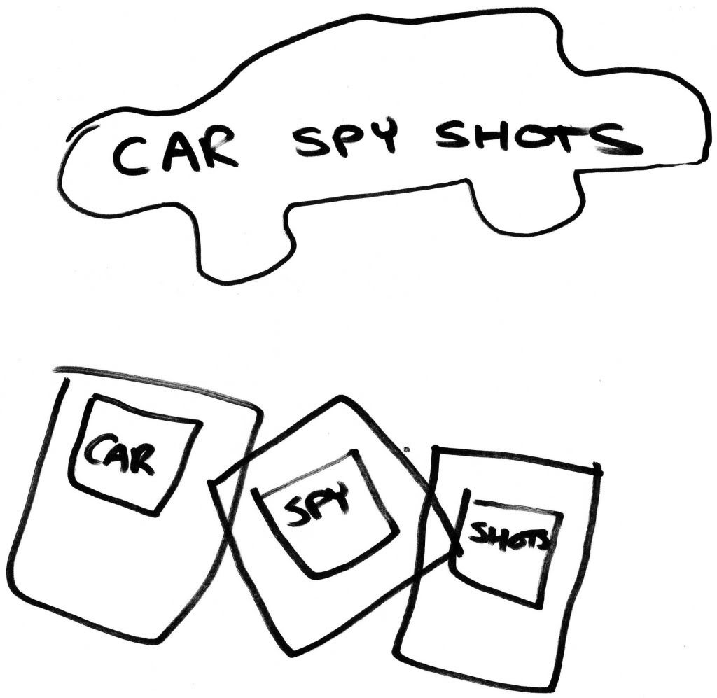
1)I think Navy Blue or Blue should be the background colour; I think most auto sites/forums I frequent have the VB Blue background. seen here http://www.ozvolks.com/forums/index.php
2)) Put a car outline over the words Car Spy Shots; IMO keep it clean and simple don't complicate the logo. or for the logo have each word inside a polaroid like shot and have them overlaping each other as if messily spread over a desk like the banner here http://www.ozvolks.com/forums/index.php |
|
|
|
08-25-2009, 05:29 PM
|
#9 |
|
|
|
|
|
|
08-25-2009, 05:42 PM
|
#10 |
|
|
Andre thanks for the reply, I do agree the black needs to go, and phaeton great suggestions and thanks for the ideas, much appreciated.
|
|
|
|
08-25-2009, 06:53 PM
|
#11 |
|
|
I thought that the colours couldn't be changed? Seem to remember some irate members argueing with mods about it?
Anyway, yeah would be good to have a facelift.. Perhaps a dark blue background, or any dark colour except for black. Perhaps new features too? On other V.Bulletin forums I use there is options to attach far more files, mp3's e.t.c (but obviously there could be copyright infringement worries). Perhaps some more smilies.. you can never have enough smilies!  As for the logo, how about something along similar lines to this..  But obviously with a better font (I did this in MSPaint and it took me all of 2 minutes  ) )I think this forum has gone real quiet. Perhaps a facelift will rectify this. |
|
|
|
08-25-2009, 07:05 PM
|
#12 |
|
|
|
|
|
|
08-25-2009, 08:31 PM
|
#13 |
|
|
|
|
|

|
08-25-2009, 08:47 PM
|
#14 |
|
|
I'm in favour of a makeover, i never liked the back scheme so this is good news. I miss the blue scheme we had in the good ol' days....but as anyone said, blue seems to be the trend in many automotive webs, so i would suggest something different, like dark red. Some spice is always welcome.
Moorhouse, i can't see your logos.... |
|
|
|
08-25-2009, 09:15 PM
|
#15 |
|
|
|
|
|
|
08-25-2009, 10:21 PM
|
#16 |
|
|
all your logos appear on my computer MOOREHOUSE, maybe it was a temporary thing or something to do with Reppu's computer?
|
|
|
|
08-31-2009, 12:16 PM
|
#17 |
|
|
If you give me a couple days (i've had a 14 and a half hour workday 6pm to 830 am and an 11 1/2 hour tomorrow starting at 6 am) i will see if i can throw together a logo
As for a theme..I would love to have the chance to code one..but busy with a few other projects at the moment..and as i said..work is trying to kill me.. but i did find this one http://www.vbulletin-faq.com/forum/s...ad.php?t=14436 and in dark blue it really seems to join the three generations of css together (arborwood simplness, proboards blue and the black of this vbulletin skin) just let me know if you like that one and then i can design my logo to sort of match that style a little bit more than just a general logo would And I might be able to take the idea that phaeton had and translate it into complex and simple graphics |
|
|
|
08-31-2009, 12:35 PM
|
#18 |
|
|
Well, I don't know what the problem is for me, I have a month old MacBook Pro running OS X and XP, but CSS doesn't work at all on Safari and has spasms when I try to post on Internet Explorer. Just downloaded Firefox and I can use CSS fine now, but it's frustrating.
As for the makeover I'm all for it, I've got nothing wrong with the current design but a change is always nice. I second the dark red mentioned earlier... |
|
|
|
08-31-2009, 04:55 PM
|
#19 |
|
|
|
|
|
|
09-01-2009, 12:10 AM
|
#20 |
|
|
I like dark blue as well. If you go with maroon, then I think it would be good to change all the parts that are currently in green to dark yellow. If blue, then mix in white, or beige if white is too bright.
|
|
|
| Reply to Thread New Thread |
«
Previous Thread
|
Next Thread
»
 Linear Mode

| Currently Active Users Viewing This Thread: 2 (0 members and 2 guests) | |
|
|

