| USA Politics |
| Reply to Thread New Thread |
|
|
 04-12-2010, 07:05 AM
|
#1 |
|
|
What's up with the logo redesign?
Two font styles and weights. One letter crossing over the circle; the other pushing up against it. If the intention is to elevate the appearance of the stores, the B&W might be a good option. 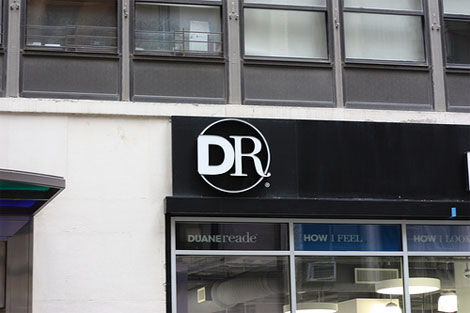 Other possibilities 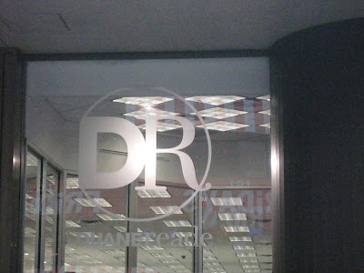 Instead of the garish 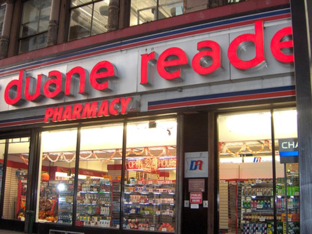 But the old logo itself wasn't the problem. 
|

|


| Reply to Thread New Thread |
«
Previous Thread
|
Next Thread
»

 Hybrid Mode
| Currently Active Users Viewing This Thread: 1 (0 members and 1 guests) | |
|
|

